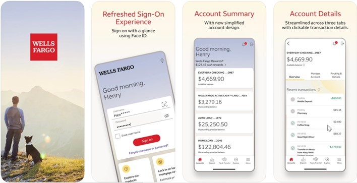
Wells Fargo released a major update to their Banking App UI on the 17th of February.
The release was widely condemned by users and public review data analysis uncovers the dramatic effect it has had on user experience and engagement ranking...
In the video above looking at Feb Banking App Trends and article below, which covers up to the end of February 2022, we analyze and compare the quality of customer experience of the Wells Fargo Mobile app against that of the banking apps for the other 4 largest banks. In February 2022 Wells Fargo announced:
We are starting to roll out the reimagined Wells Fargo Mobile® app. Over the next few months, our app will not only introduce a new design, but also improved, rebuilt mobile banking experiences.
- An overhauled, new sign-on experience
- Streamlined account views
- Checking, savings & credit card account details information, organized across 3 tabs
- Clickable transactions for more detail
- A new Pay & Transfer center; including access to Zelle®
- A new “Explore” page to help you get connected with the best products for your needs
- Easier access to your important notifications with the new alerts bell
These updates began rolling out on the 17th of February.
Background Context:
Given the relatively recent rise to dominance of banking apps over other channels (including branch), the comparative quality of their customer experience becomes a key driver of tangible value manifested in such headline KPIs as market share of new checking accounts opened, average checking account balance and cross-sell percentage. Therefore, measuring the comparative impact of the redesigned Wells Fargo app becomes a critical source of feedback for its likely impact on the bank’s overall business performance, not just the experience of the app itself.
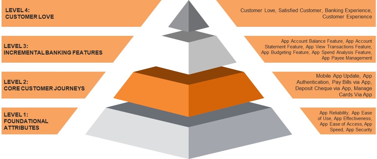
The most reliable source of data for banks’ apps comparative customer experience are the user ratings and customer feedback obtained via Google Play and iOS Appstore. These are filtered to omit ratings without comments, therefore focusing on a core of engaged customers whose verbatim comments can be further analyzed to categorize the reasons why the user rated the app as they did. This informs a “hierarchy of experience” which provides a strong explanatory schema to the absolute app ratings.
Level 4: How much the bank’s customers love the app and their overall satisfaction at the experience
Level 3: Essential banking tasks that are required to emulate the usual checking account functionality
Level 2: Most critical customer journeys that enable key technical and banking tasks to be completed
Level 1: Fundamental architectural elements that represent table stakes for a successful banking app
Level 1 has the highest frequency of app reviews, but Level 2 reviews have the greatest impact on overall ratings. This is because banking apps have generally progressed from foundational attributes as a significant point of difference (most apps now have adequate levels of security, reliability, usability etc.) and the customer conversation has moved into relative performance in core customer journeys and incremental banking features where some apps are better than others.
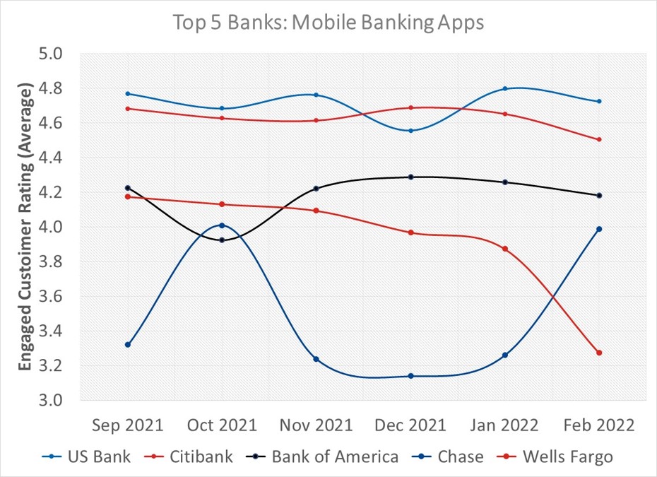
Looking at the trend in overall app ratings for the big 5 we can see that their ranking positions between September and February are relatively unchanged except that the Chase and Wells Fargo apps swap places at the bottom. Wells Fargo’s sudden drop in February by 60 basis points (3.27 from 3.87) can be most obviously explained by the immediate repercussions of the app update, although its trend was still slightly downward until then.
The sort of questions the Wells Fargo executive team might be asking of their app redesign and relaunch are:
- Was the original rationale for the relaunch correct?
- Is the negative impact on engaged customer rating a temporary blip or a long-term trend?
- What aspects of customer experience is the relaunch most impacting?
- What should be done to fix those aspects most impacted?
1. Was the original rationale for the relaunch correct?
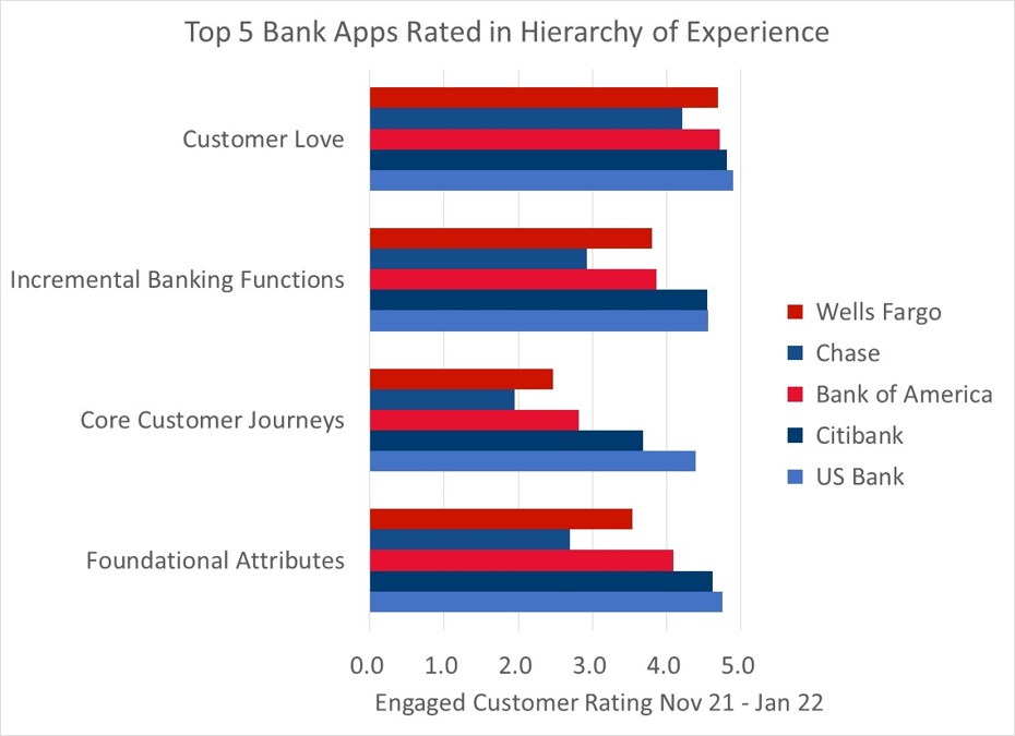
Looking at how Wells Fargo Mobile (WFM) ranks against the other big 4 apps for each level of customer experience we see that prior to February it ranked at #4 behind US Bank, CitiDirect and Bank of America for Foundational Attributes and Core Customer Journeys, and at #3= with Bank of America for Incremental Banking Functions and Customer Love (where the top 5 except for Chase are very close to the highest possible rating). So, there was certainly room for WFM to improve aspects of its experience, with perhaps Foundational Attributes and Core Customer Journeys representing the most obvious opportunities.

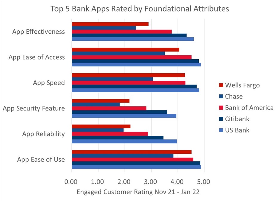
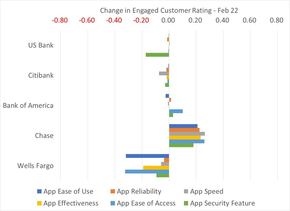
Drilling down into Foundational Attributes, we see that prior to February WFM was on a par with or just behind the #3 ranked app for Ease of Use and Speed and the gap between it and the #1 and #2 apps was very close (because its ratings were already ~4.5.) However, it was significantly behind the #3 app for Reliability, Security and Effectiveness leaving considerable room for improvement from a ratings base of 2.2 - 2.9.
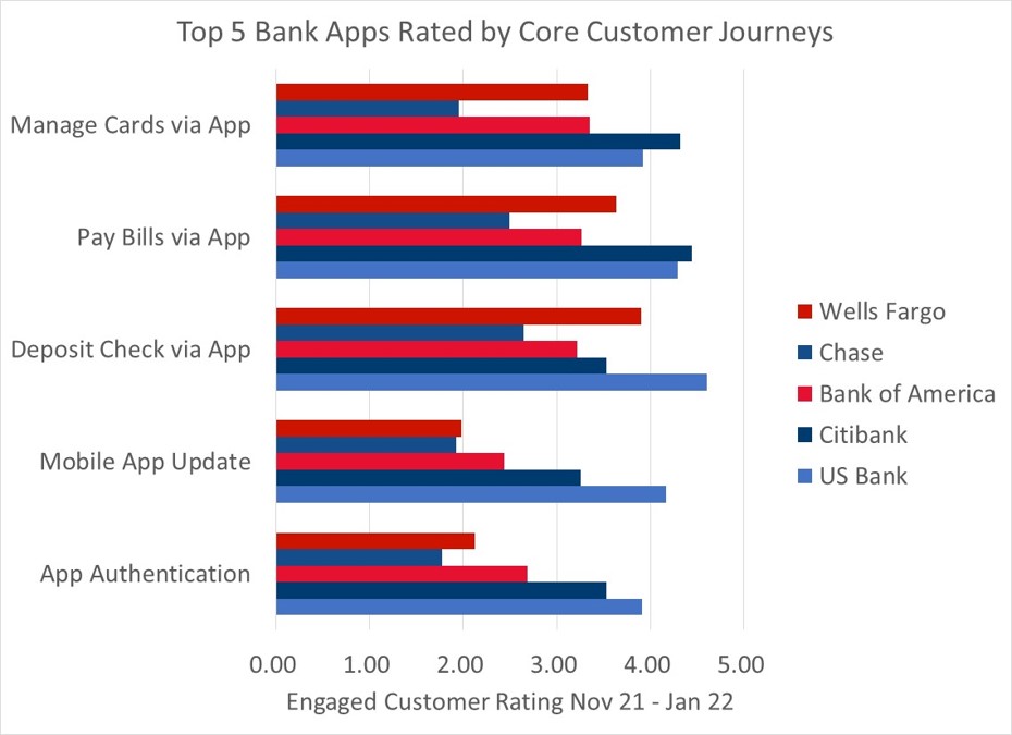
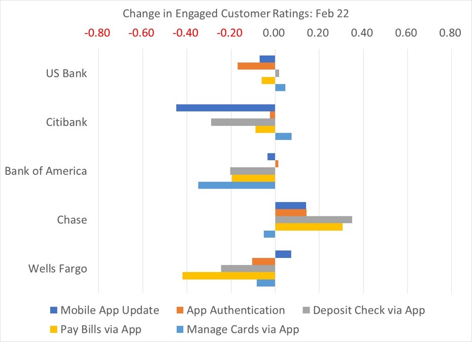
Moving up into Core Customer Journeys prior to February WFM was #2 in Check Depositing, outright #3 in Paying Bills and =#3 in Managing Cards. However, it was a low #4 in both App Authentication and Mobile Phone Updates.
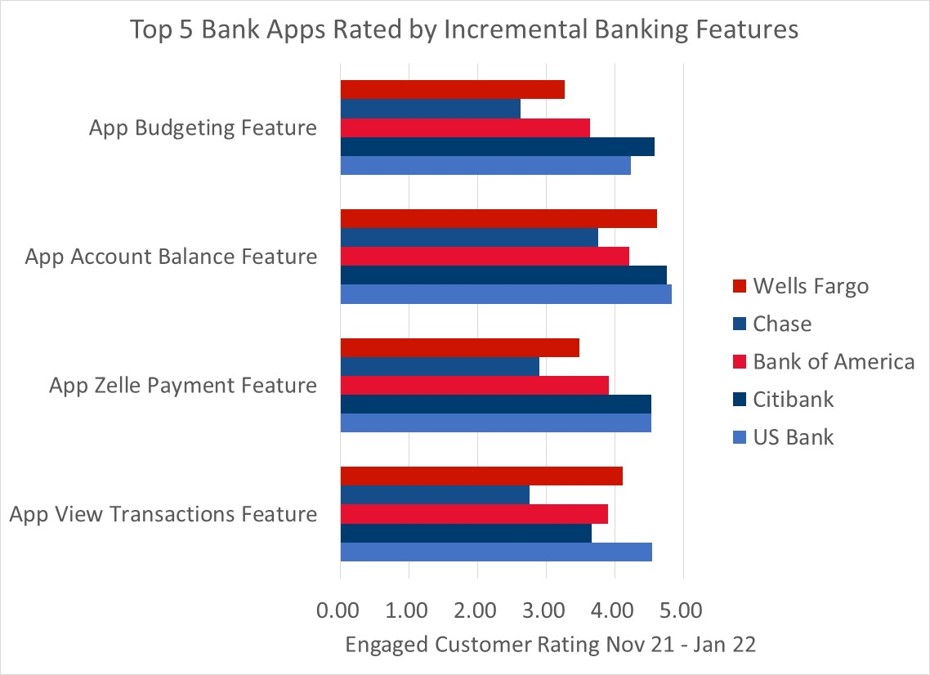
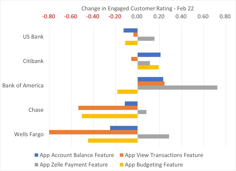
Finally in Incremental Banking Features WFM pre-relaunch was #2 in View Transactions, a close #3 in Account Balance Feature and #4 in Zelle Payments and Budgeting Features.

To summarize the WFM position before the February relaunch the app was rated relatively highly for usability and speed, for the core banking journeys of depositing checks, paying bills and managing cards and for the key features of looking up balances and viewing transactions. However, it was downrated for reliability, security and effectiveness and for the core user experience journeys of authentication and updates. So, a tentative answer to the question: “Was the original rationale for the relaunch correct?” might be that the relaunch based on a “reimagined, redesigned mobile app experience” may not have been as successful as if it had focused on the fundamentals of reliability, security and effectiveness and the core customer journeys of updates and authentication (although to be fair “an overhauled, new sign-on experience” seems to have been high on the mandate.)
2. Is the negative impact on engaged customer rating a temporary blip or a long-term trend?
Although time will eventually answer this question there is an urgent need to decide whether and what immediate rectification is required now before the relaunched app does too much damage to the critical business outcomes it is designed to support.
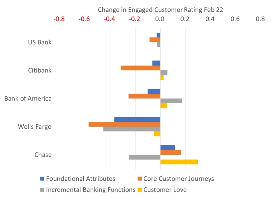
Looking at the relative change in the WFM ratings for the three months to the end February (i.e., including the relaunch) we can see that Foundational Attributes (-0.4), Core Customer Journeys (-0.6) and Incremental Banking Features (-0.5) have all been downrated at a rate of change significantly below that for the general trends shown by the other apps. This looks like a substantive trend rather than a temporary blip which will only deepen as successive post relaunch months get added to the timeframe.
3. What aspects of customer experience is the relaunch most impacting?
Of the three levels of Wells Fargo experience whose ratings have deteriorated since the WFM relaunch the two having most impact (rating weighted by frequency) on the overall app rating are Foundational Attributes and Core Customer Journeys. Drilling down first into Foundational Attributes we can see that Ease of Use (-0.33) and Ease of Access (-0.32) are the two attributes whose ratings are most changed. Of these Ease of Use has the bigger impact on the overall app rating (+0.07) reduced by 50% from January (+0.14).
Now looking at Core Customer Journeys we can see that the WFM journeys whose ratings most changed with February are Check Depositing (-0.42), Paying Bills (-0.25) and Authentication (-0.11). Of these Authentication has the biggest impact on the overall app rating (-0.15) increased from -0.12 in January.
Finally at the Incremental Banking Features level the experiences of the WFM View Transactions (-1.20), Budgeting (-0.45) and Account Balance (-0.25) features have most changed with February.
Tying these strands together it appears that the WFM relaunch is having the biggest negative impact on two of its competitively strongest pre-existing foundational attributes, namely the quality of its user experience and the ease of its app access. Correspondingly it is failing to improve the comparably weakest attributes: reliability, security and effectiveness. The impact on user experience and accessibility also appears to be having a knock-on effect on two of the most important and highly rated customer journeys (paying bills and check depositing) while not yet improving the authentication issue. Also concerning is that two of the incremental banking features where WFM was rated comparably highly have also suffered substantial deterioration in experience.
4. What should be done to fix those aspects most impacted?
As the farmer who was asked directions reputedly said: “If you want to go there, I wouldn’t start from here.” If the hypothesis proves correct that the redesigned WFM user interface is the underlying driver of the overall deterioration in ratings including accessibility, core journeys and incremental banking features then that is where most attention needs to be directed. Interrogation of verbatim feedback specifically relating to usability may elucidate exactly what aspect of the U/I is causing the most pain, be it look and feel, screen design or navigation but this certainly needs to be understood in depth before further revisions are implemented.
A very good first step would be to analyze exactly what has changed in the U/I pertaining to the core customer journeys and banking features whose experience has slipped most in the ratings. This would suggest a way of incrementally adjusting the user experience in order of priority of the most critical customer and banking functions that would fall short of a major reconstruction or even rollback. The additional advantage of this approach is that the impacts on customer experience can be monitored incrementally, so enabling progress to be made in an experimental and relatively low-risk way.
Perhaps the most obvious learning is that an overarching, all singing and all dancing app relaunch is most likely to encounter resistance, simply because of the overwhelming novelty of the changes made, and this also makes it harder to understand exactly where the redesign is working and where it isn’t. In the case of the WFM redesign a thoroughgoing diagnostic analysis of the market comparable strengths and weaknesses of the existing app would have led to tighter development brief as well as directly resolving known shortfalls without creating a slew of new ones.
