Delivering Successful UI Changes to Your Banking App
Banking apps are regularly updated to improve security and introduce new features. Changes in the user interface (UI) can be unsettling for users, particularly when it affects their financial transactions.
By leveraging the Ipiphany platform, we can analyse, and understand how UI changes impact the user experience in real time.
Touchpoint Group’s AI platform, Ipiphany, provides real insights value out of the box:
 |
Automated categorisation and organisation of feedback data into 10s-of-thousands of topics and themes in context to an industry sectors |
|
Benchmarking |
|
Insights at scale |
|
Insights at granular detail |
|
Easy report customisation |
|
Report update automation as new data is processed |
|
No insights missed |
|
Data processed from a variety of sources |
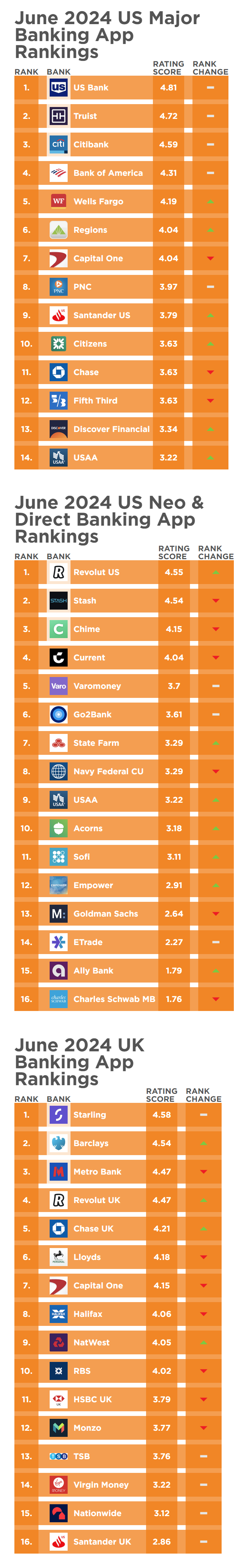
In this webinar, we explore the topic of successful UI changes by looking at the performance of Santander's UK mobile banking app, and we examine how recent UI changes by Santander have influenced customer satisfaction.
To help highlight the impact of UI changes, we analysed public reviews from Santander UK's mobile banking app on Google Play and the App Store. We focused on data from August 2022 to June 2024, providing a comprehensive view of user feedback over this period.
Santander's UK mobile banking app experiences highlight the challenges and impacts of UI changes on user experience. We trust you will find the webinar informative and educational.
Ipiphany enables banks to understand and address issues effectively, ensuring customer satisfaction and loyalty. As banking apps continue to evolve, maintaining a user-friendly interface is crucial for retaining customers and fostering positive user experiences.
Video Transcript
00:00:05 - Glenn: People are creatures of habit and many of us are uncomfortable with change. Now, when that is coupled with sensitivity around our finances, changing in banking app ah, user interfaces can cause significant unrest. Now, banking apps are constantly updated to adhere to the latest security protocols. Add new features to make it easier for customers to manage their banking needs through their mobile phone.
So that change is inevitable. And it's incredibly simple to see the impact on user experience using the Ipiphany platform. So let's take a look at how Ipiphany can help users understand in real time how these changes can impact user experience. Yazad kakariya, glad to have you on board again.
This month. Let's dig into changes in UI and the impact it can have on that user experience. Who are you gonna talk about today to give us an example of that?
00:01:04 - Yazad Sure. Thanks, Glenn. So the example that we have today to highlight your point of understanding changes in design and UI is going to be Santander in the UK market. So for the purpose of this demonstration, the data that we have consists of public reviews from all the users of Santander, UK mobile banking app who have left, their reviews along with comments on Google Play or App Store.
So this is what we are going to be analysing and talking about today. So what you see in front of you right now over here is the rating, or the Engaged Customer Score, as we call it, from the period of August 2022 right until June 2024. So looking at a period of about two years, and we're going to be taking a quick look at how Santander has performed during this time period before we reach our main topic.
So, if I take a quick look at the performance from the period of August 2020 to right until October 2023, performance has been quite consistent in the range of about 3.75 to 4.25. So the average is around four. Then of course, they had some hiccup in the months of November and December last year, but then in January and February were seeing signs of recovery.
However, in the month of April, user experience has dropped to a very low point, a point where it's never dropped in the last two years. It's at about 2.5 in the month of April. And as you can see, performance has always been much, much higher than that in the past.
So what we are going to do is we are going to explore and see what has happened over here and what's caused this performance to drop to such a low level in the month of April. So in order to do that, as you can see, over here I have about 1700 user reviews and comments for the month of April.
I'm going to take a few moments and I'm going to explore what the customers have been saying, and in order to do that, I will be making use of one of the most unique features of our AI powered analytics platform Ipiphany to understand the key topics of feedback that customers shared in the month of April.
Here you can see different coloured clusters which have been formed. So this is formed based on the different conversations that customers are having and this gives us a very detailed view in terms of what are the key things that we need to look out for while analysing customer feedback and what is it that should go into our analytical framework when we measure performance during this particular time.
So here I have zoomed in on one of the main clusters that I can see here, which talks about the app layout, new version in comparison to the old version, change in interface, awful layout, etcetera. So I'm a bit curious to see what's happened over here. So let's just start exploring by clicking on the version and when I do that straight away, I can see a few key themes coming up over here. Firstly, anyone who's spoken about the app version is likely to give me a score of 1.7, which is much lower than my overall average of 2.5.
So it tells me that this has been one of the key pain points for Santander customers in the month of April. Then I can see a little trend analysis over here, but I want to understand more details. Here we go. So there's quite a bit of feedback coming through from customers regarding the new version, and they're also making reference to the earlier version that they used.
So clearly, in the month of April there has been a big change in the way the app has been designed and the app layout as well. So what I can do is if I click on any of these particular topics coming up straight away, it takes me to the comments that customers have mentioned.
So here we can see for the old version. “When I get into the new version, I'm still using the old version of the app”. “Have uninstalled and reinstalled, but still the old version is coming”, “bring back the old version”. “The old version was perfectly functional”. So here we are seeing quite a lot of backlash from customers in regards to the change in this version.
And it's not a very uncommon thing because yes, there is some initial resistance, but the key point is that customers would get used to the newer version as time passes and probably the bank may also make some changes and upgrade this new version to make it more helpful for customers.
So here we have explored this particular topic and now what I'm going to do is I'm also going to take a quick look at some of the other topics like user interface etcetera, and see a few examples from here. The new interface is awful and there are some more comments which are talking about the new interface where customers are particularly not happy with the way the new interface has been designed.
Now, this is one of the key visualisations that we use to explore the data coming through from customers. May it be public reviews or may it be customer surveys. This particular visualisation helps us get a detailed understanding of what customers are talking about. Now the next question is, okay, so here now, I know the key topics of discussion, but is there a way I can quantify them, measure them and track user experience?
And the answer is, yes, we can. So what we can do is, after exploring the data, we can create our own analytics framework or reporting framework within this platform that then helps us measure and track the topics of interest and see how the performance has been changing over time.
So here, in this particular visualisation, we'll take you through the framework that we've created. So, firstly, what we are doing is we are looking at the Engaged Customer Score and how it's dropped in the month of April. It's dropped from 3.5 in March to 2.5 in April. Now, our objective is to understand why this change has taken place.
So here on the left hand side, I have four main topics, which are the four foundational pillars that any banking app needs to perform well on, in order for the customer experience to be smooth and the app to be successful in the market. So here what we are seeing are Pain points analysis, which means the percentages of the numbers over here are talking about customers who have highlighted issues with this particular app. So in the month of April, these are the April numbers, we can see that one thirds of the total customers have highlighted Reliability and Stability related issues. And this has gone up by about nine points compared to the previous month. Then when we look at Design and. UI, we see a very sharp increase in design and UI related fees feedback as well. So this was, about seven to 8, about 8% in, the month of March.
And now that's increased to about 17% to 18% in the month of April. So this is one of the key areas where we can see that there are some issues going on, and then there are also some issues with the app authentication itself too. Now, in order to understand this in greater detail, we can then create a number of subtopics under any particular topic to get that level of granularity or that level of detail which allows users to pinpoint on customer experiences and take corrective actions straight away. So if I click on design and UI over here, straight away, the summary opens up and here is an example from a customer.
Here we can see the recent trends and we can see that this particular area has underperformed compared to the overall experience in this month. Let's see, what are the few key things in design and UI which are going on over here.
So this is a dynamic workload which has been created to pick up and highlight the key themes within this topic that we are exploring over here. So users can have on their fingertips what the key changes are. So here there's some conversation around showing balance “so I missed the convenient widget showing my balance on my home screen without having to open the app every time”. “The balance shown first was the actual balance, not the total with pending”. “So, so much easier to read and understand”. So here, customers have expressed dissatisfaction with the way the balance is showing in the newer version.
Then there is also some feedback about the app being difficult to navigate. So some customers have highlighted that they find the newer version of the app slightly more difficult to navigate. It's poorly laid out and it's difficult to navigate. So what we can actually do is any of the topics that we are interested in over here, we can create a topic, drag it into our reporting framework, and then track how we've been performing on that topic going forward.
One more key feature that we have is our integration with OpenAI, which allows our users to make sense and summarise this particular topic, even without reading a single comment. So here what we've done is, in order to understand Design and UI in greater detail, we have asked OpenAI to help us summarise this topic.
And here you can see the top five themes coming up over here, which talk about the Design and UI related problems that customers have faced. So the app is difficult to use, it's confusing, layout is complicated and navigation is slow and clunky, poor layout in. Design with Reliability related issues and negative impact of the most recent update, in which they have changed the Design and UI related features.
00:10:10 - Glenn: So that makes it really quick and easy for product teams to identify user interface issues. And in this instance, navigation and the ability to actually find your data seems to be really, really prevalent. So how have things changed? Since April.
00:10:27 - Yazad: Yeah, key point, Glenn, because the idea of having an AI-powered analytics platform is to uncover the insights, get a sense of customer experience, and then of course, track it and measure your improvements too. Now, in the case of Santander and the changes which have taken place since April, here we have this view where we are tracking the four main pain points across different months starting from January 2024.
And of course in April, we can see that the total number of pain points have shot up sharply if we look at the performance post April. So after the change was done in April, there have been a few newer versions which have been launched and you would expect to see an improvement over there.
But let's take a look at each of these pillars and see where we can send some improvement. So in case of reliability and stability, before April, this was particularly in the range of 20 to 25, as we can see over here, the total number of pain points coming through.
But since the newer version has been launched in April, this has increased and now it's in a range of about 30 to 35. And we do not really see any sharp improvements in this area, even in the month of June. Next one, looking at Authentication, which used to be under ten, prior to the change in April, this increased to 70%.
And then of course in May and June, we are seeing some amount of improvement where the pain points have then dropped to about 12 and 13. The next one, which is the key one, is about the Design and UI of the app. So here prior to the change, you can see it was about 6% to 8% dissatisfaction with Design and UI, but that suddenly doubled in the month of April. But interestingly, it still continues to remain a key pain point, even May and June. So in May as well, the proportion of customers highlighting this issue was exactly identical to April. And in the month of June, we are seeing some signs of some improvement over there, as pain points have dropped by 2% from 17.6 to 15.6.
So hopefully in the month of July, we will see this particular area scoring better in terms of user experience going forward as users will start getting used to the newer version, and probably Santander will make some upgrades as well to alleviate the pain that users are having.
00:12:44 - Glenn: And those comments around third party doesn't necessarily mean that the bank is doing anything underhand. It could actually just highlight a communication disconnect between some of the policy and what people understand. So, these are the sorts of things that if you're aware of, you can get ahead of early.
Today, we've seen how Ipiphany can help users identify design and user interface issues in just a matter of minutes, and we do strongly recommend that insights and product teams empower themselves with tools like Ipiphany so that they can consistently monitor, investigate and take proactive action quickly to improve their customer experience, loyalty, and in the end, bottom line for the bank if you want to have a look under the hood in regards to your app, feel free to sing out.
We're more than happy to set up a demo.